Analytics Dashboard
Nextpoint Web Application
Company Details
Nextpoint is a litigation software web application. Nextpoint helps attorneys, paralegals, litigation specialists, and other law professionals through every stage of the litigation cycle, from collection, document review, and coding to depositions and presentation. It is a responsive web application that is built primarily in Ruby on Rails, Javascript, HTML, and CSS. There are two parts of the application, Review and Prep. Review was primarily used for culling down data and preparing documents for production, and Prep was primarily used for depositions, transcripts, and presenting documents within court.
The Challenge
What do our clients need to better visualize the data collected?
For this project, the goal was to get a better idea of the data that had been collected and imported into Nextpoint. From there, our users needed an easier way to cull down what data needed to be reviewed and coded for production.
The Team
Client success manager Product designer/front end developer Two full stack developers
My Role
User interviews, research, ideation, wireframing, front end development, testing and QA, marketing support
Tools
The Process


Research
User Interviews
At the first meeting, our project team gathered information that had been collected from client success and sales calls regarding what data visualizations had been requested with the Review platform. This information was reported within JIRA. To get a better understanding of what our clients were looking for, we invited 6-7 power users from those firms to answer a series of questions about their workflow within Nextpoint and what they were looking for in an analytics tool. These questions were created by myself and the client success manager and the interviews were conducted either in Zoom or by phone.
Google Analytics
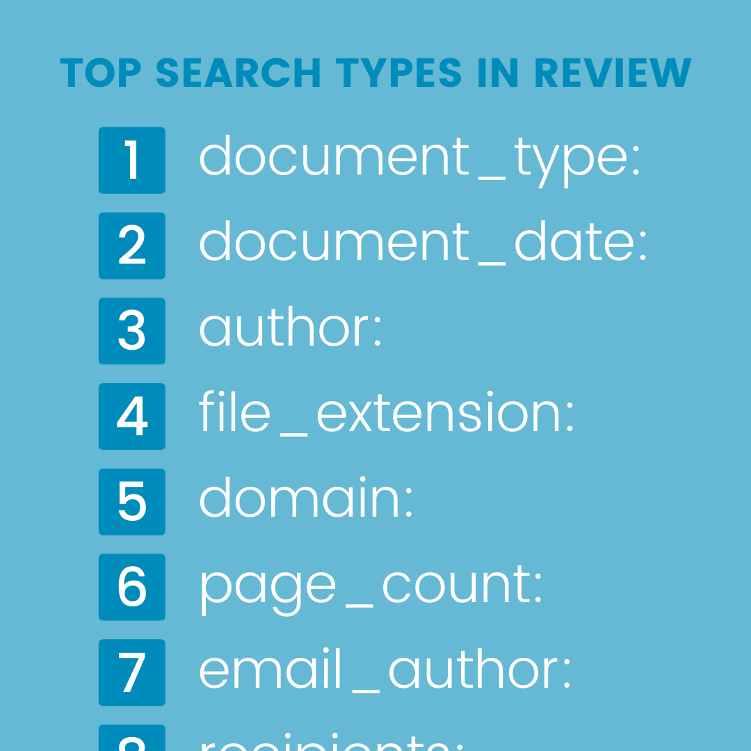
Nextpoint tracked top search types in Review within Google Analytics. Pulling that information, we used it as a resource for what data should be included in the analytics tool, how it should be displayed, and how it should be laid out. More prevalent search types were placed in areas of more importance on the page.
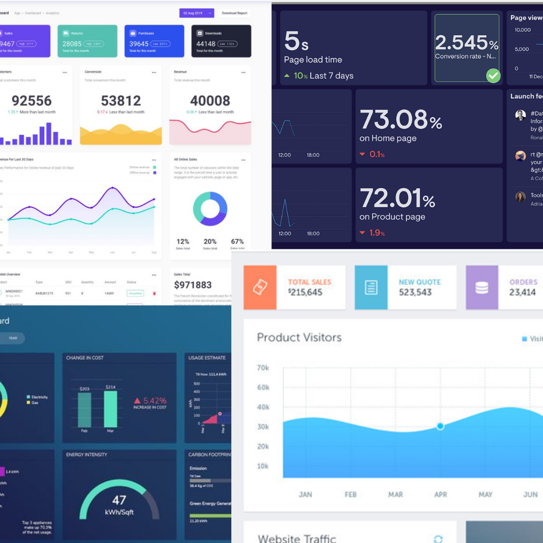
Mood Board
Looking at a variety of different applications, I made a mood board, trying to get a feel of what analytics tools people were using in other SaaS products. This was helpful in determining what kind of data and layouts our users may be seeing in other applications and were therefore more accustomed to seeing.
What we discovered from our research
Ideate & Iterate
Low fidelity wireframes
Taking all the information we had collected, I came up with several low fidelity wireframes of potential layouts for the tool. Once the wireframes were approved by our project team, we got them in front of our power users for feedback and further updates. This is also the point where we determined the scope of the project, knowing with our small team and quick timeline we would need to add certain features in the future to keep the scope of the project small.
High fidelity wireframes
Based on the sketches, I created high fidelity wireframes in Sketch. We took these wireframes in front of our power users one final time before getting tickets made in JIRA for development. Because I was doing the front end development there was no hand-off needed and if the developers had any questions about the design, they could easily hop on a zoom with me for answers.
Develop & Deliver
Front End Development
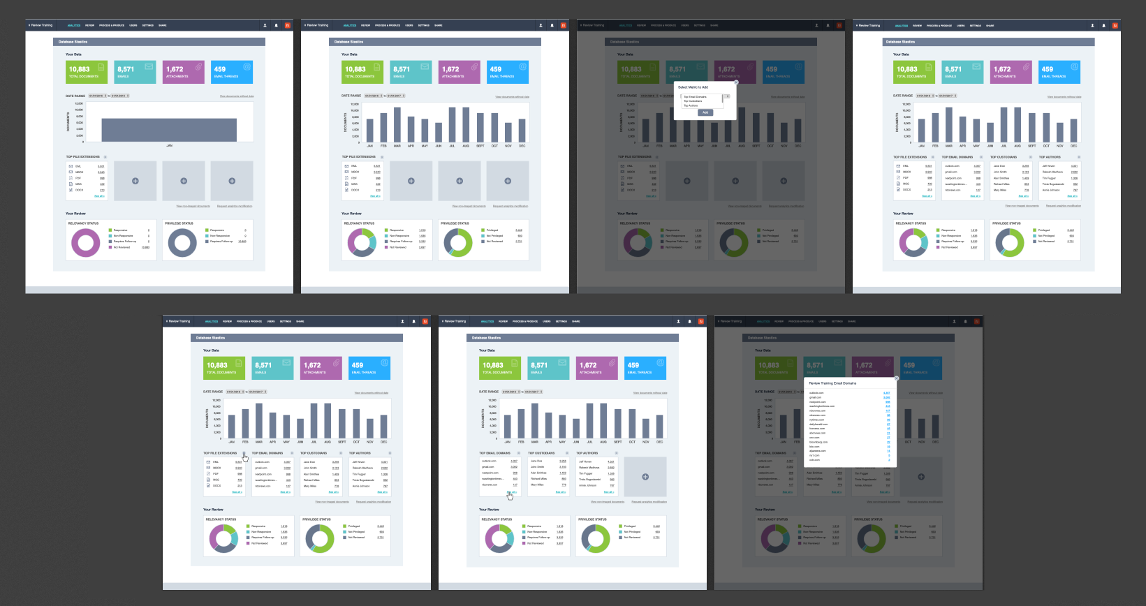
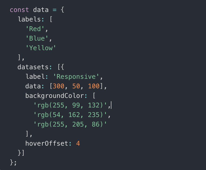
Working closely with our two full stack developers, I used HTML, CSS, Javascript, and Ruby on Rails to build the front end of the analytics tool. Each component of the tool was clickable and would run a database search to display the correct information on our search results page. For the charts, we used Chart.js. The project was built over two months, with each sprint working on a new section of the page. Because we did not have a QA team, we were responsible for our own testing on tablets and all browsers.
The Final Feature
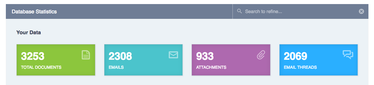
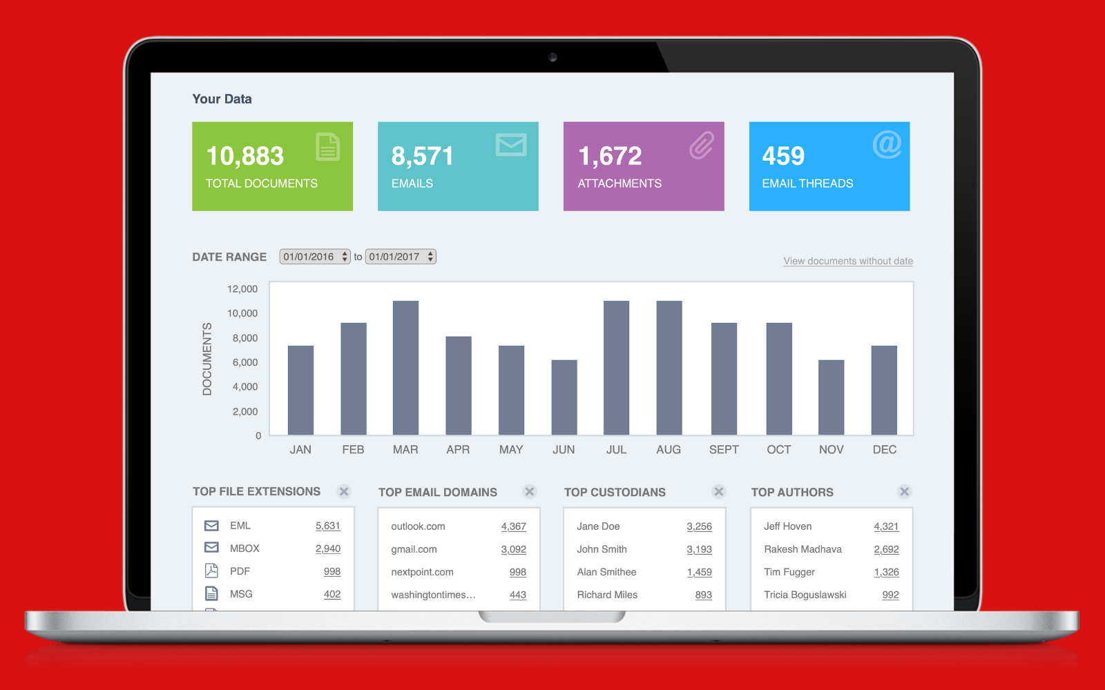
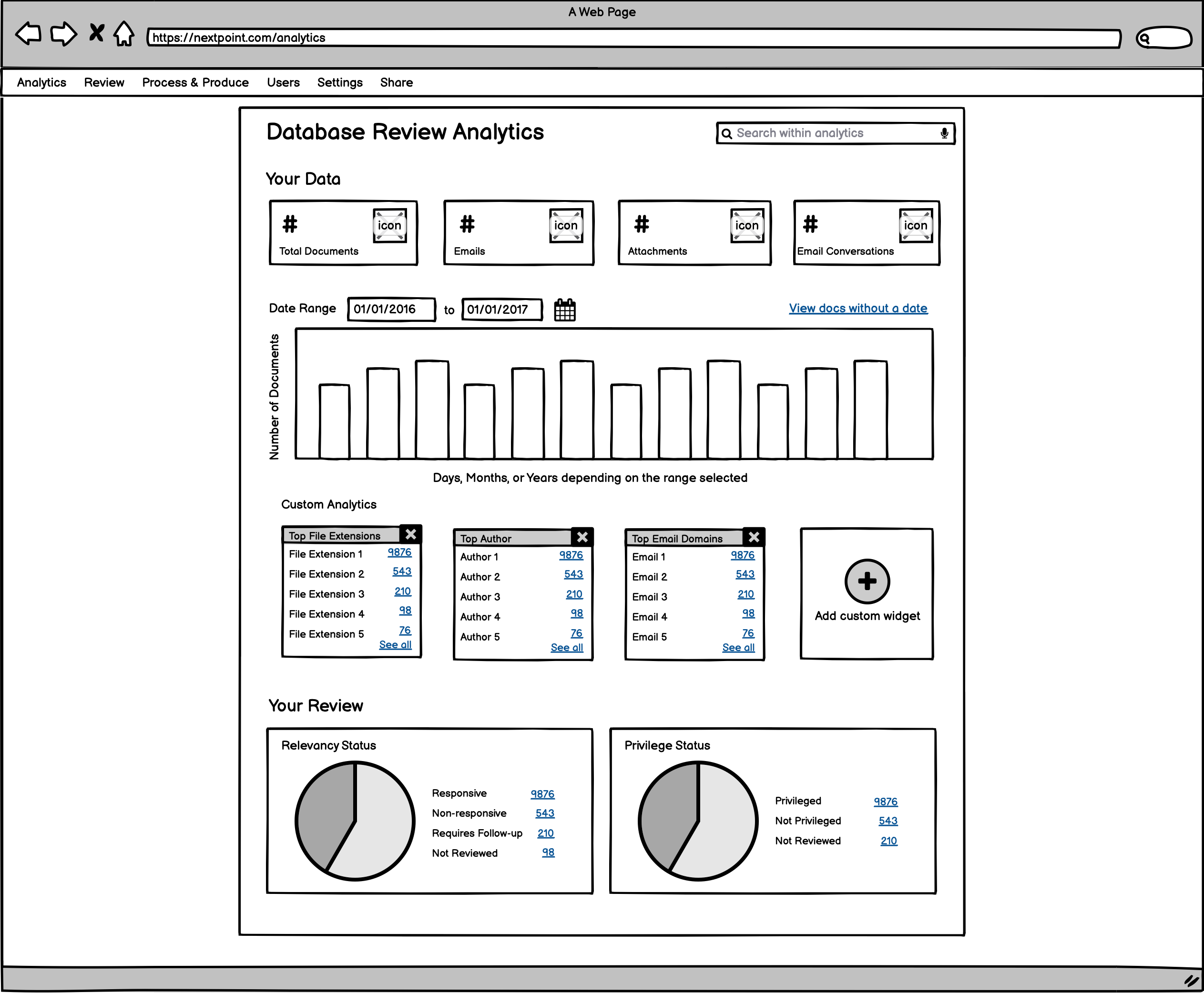
Your Data
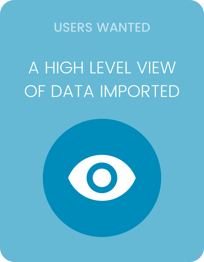
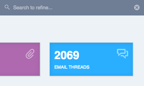
Since our users wanted to see a high level view of their data, in this first section we included total documents that had been imported. This included all data imported (in Nextpoint any file that is imported is converted to a document for review). We then added three more high level data points based on the the most performed searches by data_type: emails, attachments, and email threads (conversations). When the user clicked on one of the boxes, they would be brought to a page with the search results populated based on the box they clicked.
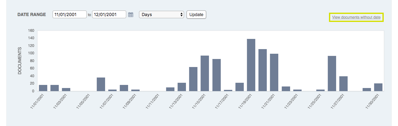
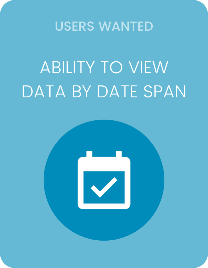
Document Date Chart
The next section of the page included a date column chart. This was useful for our users as they could choose a certain date span, click on the column within the chart, and review all the documents for a given date range. This was especially helpful if they knew the documents they needed to review were from a given time period. Because data is messy, this chart was a good indication if some documents did not have date metadata included on import. If that was the case, users could click the link "view documents without a date" to see which documents needed to be updated to include a date.
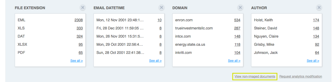
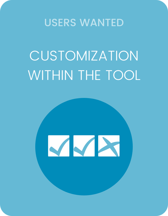
Custom Widgets
Our users wanted some customization within the analytics tool. So we developed out custom widgets where they could choose which four data groupings they wanted to be able to see. These groupings were chosen primarily by what we heard from our users in feedback calls, as well as top searches in Google Analytics. Once a user chose their data grouping, they could easily click on one of the top 5 results to view the documents of that search result or click see all to view all results. From there they would see a pop-up of all the results and click to run a search if they so wished.
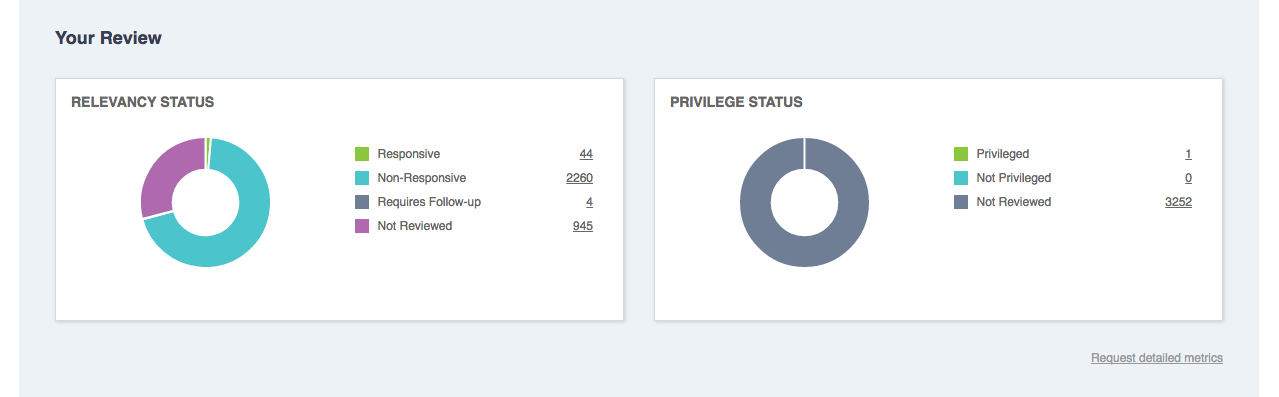
Your Review
To keep an eye on which documents had been reviewed to relevancy and privileged, we included two doughnut charts. This was helpful for our power users, as oftentimes they were in charge of conducting the review or leading a team of reviewers. Each chart and total in this section was linked to run a search for relevancy or privileged status so the results were easily accessible.
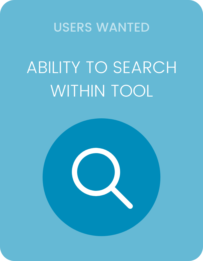
Searching Within the Tool
Users were given the ability to search within the analytics tool. This would run an "AND" search. For example, if a user wanted to view all the data with the author Joe, a user could type in the search bar, "Author: John Doe" and press "enter". The totals and data groupings would then repopulate to only show information with the author John Doe.
Marketing & Client Support
During this time, I was still responsible for some marketing work. I created the marketing email for the feature update in Hubspot and HTML and created the Zendesk support topic, writing the copy and organizing the layout with some slight HTML tweaks.
Project Takeaways
For the scope of the project, we recognized this was a good first step. Our users were able to get a good idea of what data was in their database and had a good starting point after importing and during their review. We knew we wanted to add more customization in the future, as well as some other data points when it came to producing documents post-review, but with our small team, we were proud that this project came together within the time frame it did.


Becca Schutzius
Copyright © 2021